ROOF

Thank you for visiting the Routemaster Owner and Operator's Forum (ROOF). Please feel free to use this forum for the mature discussion of any issues of interest and relevance to Routemaster owners. Please do not use this board to publicise your feelings about individuals, National or Local Government or TFL policy. Owners of other London bus types in service during the 1950s, 60s and 70s are also welcome to contribute to this forum.

Please note, the ROOF website no longer exists. The link from the Forum does not work anymore.  Useful information and links from the website has been posted to the Forum.

Please do not respond to abusive posts but notify ROOFmoderator 1@outlook.com.

ROOF
Start a New Topic 
Author
Comment
Gold Lettering

Just picking up on what Neil mentioned about the scruffiest RML and gold transfers.

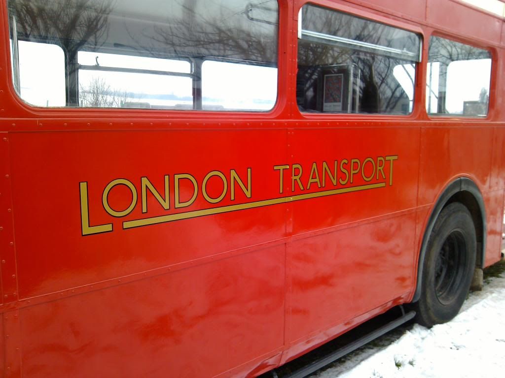
I got these done for 1013 last week. I found the font on the interweb, took it to a local printer and graphics chap, guessed the size and I think it has come out very well. 50 quid all in for both sides.

LT lettering photo IMG_20140131_101726_zps8c275f57.jpg

H.

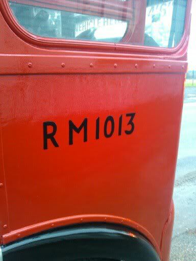
My bus number (if any): RM1013

Re: Gold Lettering

The correct position of the London Transport transfer on RTs and RMs
Centre of T ( of TRANSPORT) is centred on the centre of the vertical straplate. The horizontal centre of transfer is equi-distant between top and bottom mouldings.

Can't post image but it's here:

http://www.flickr.com/photos/34955393@N04/12278192136/


My bus number (if any): RTL 960, RMC 1458 RM 1585 and several RTs

Re: Gold Lettering

The other common mistake is to make the lettering different thicknesses. While the heights are different, the lettering's the same thickeness!

What you have to do is use say a 48 point normal for the L and T, you then use a 40 point BOLD for the ondon Transpor.

Re: Gold Lettering

The font for the LONDON TRANSPORT legend was the same size for all the upper case characters but the L & T were bespoke characters modified by a typographer by hand so are not found in a normal font range.

The thickness of the characters remains constant but the depth changes. The underline is also the same constant thickness as the characters.

Computer based fonts are far less versatile than the skill and ability of a typographer, yet another highly skilled profession that is dying out.

It is very evident in the work of Johnston with the original LT fonts he created and the subsequent updates over time.

The more recent updates from the 1980s are computer aided and far less flexible and adaptable than when done by hand. Very evident on comparison of many tube station signs which are now lacking the impact of the originals.

There are some excellent books on the LT fonts and their development. Like a lot of other books on LT, they are very informative and show the length of detail and innovation that was the norm.

What has baffled me is that with such a wealth of heritage to hand, modern day , and rather expensive TfL, Bus and Underground design consultants seem oblivious to the points of reference and get so much wrong or retrograde.

Re: Gold Lettering

"....What has baffled me is that with such a wealth of heritage to hand, modern day , and rather expensive TfL, Bus and Underground design consultants seem oblivious to the points of reference and get so much wrong or retrograde."

There is or was a design manual for London Underground that shows all signs/sizes/scales/proportions etc. Used to be overseen by Director of Architecture and Design.
We were lucky in having an original LT transfer and had them made up by our vinyl producer. We fix them a little higher than they should really be to avoid a lot of road dirt and muck.

http://www.flickr.com/photos/34955393@N04/10140669993/in/set-72157636294478114

My bus number (if any): RTL 960, RMC 1458 RM 1585 and several RTs

Re: Gold Lettering

I share Mark's sentiment on the issue of heritage. With all the resources of LTs rich design applications it is odd to see so many gaffes and oversights these days, especially when effort has been made to conserve the heritage.

It's a shame a bit too much now relies on the computer doing everything.

The subtle details to something as simplistic as the ' LONDON TRANSPORT ' fleetname are so good that few even notice. But when it looks right it looks right and that is down as Mark mentioned, to the skill of the typographic designer.

Nowadays, the attention to detail is restricted by what the computer can do, But it is deemed acceptable.

In the days of doing it in the painstaking by hand method, only excellent was acceptable. The skill of a trained eye saw to that.

On the plus, what can be done now can be done very quickly

I had ( and hopefully still have somewhere) a copy of a 1972 LTE design guide manual and it really is excellent, covers every detail and whom to contact if in doubt.

I never saw a later edition although I know there were a few updated addendums.

Modern Bus and Train seats are clearly the product of CAD design and are truly uncomfortable in almost every case.

They simply do not relate to the ergonomics of the human being.

Handrails are the same, compare the superb ergonomics of the Rear platform handrail on an RM to almost any later vehicle. Legend has it it was designed by a WW2 disabled veteran who had lost an arm and worked out how to use the bus with just one hand. It may well be a myth but it does work and clearly much thought had gone into it.

Quite why TfL ordered the removal of this handrail on the Marshall refurbs for a vastly inferior replacement is another brain number!!

Modern handrails are often so thick that someone with small hands ot arthritic hands simply cannot get a secure grip.

Re: Gold Lettering

The Isle of Wight steam railway found a similar problem: what is "standard" Southern Railway lettering? Their historian Terry Hastings done a great deal of research into the matter and found there was NO standard Southern Railway lettering! There was a standard STYLE and that was about it! He published an excellent article on it in a past copy of Island Rail News.

Meanwhile back to LT, it IS possible to reproduce the underlined fleetname on the computer if you follow what I said earlier about using a light big font for the LT and normal smaller font for the rest! The chaps at the late PG Signs got it sussed.

LT also had a set of paint diagrams for all the buses which showed the exact position of all the transfers. But then looking at the works drawing of the BEA 4RF4, it says all dimensions +/- 1/8", which could mean your bus is 2" longer than it was designed to be!!

My bus number (if any): RML2532

Re: Gold Lettering

hi all if any of you need any transfers in the original varnish fix for our London transport vehicles then i have 90% of them and have just had the gold numbers and letters remade in varnish fix and if you ever need a diagram as to where they may go drop me a line even for a BEA RT or RM or maybe if you dont feel you can put the varnish fix on i have contacts who will or i have vinyl from original pattern in stock RT 8 is varnish fix .if any one has any different diagrams id be interested

My bus number (if any): RCL2238,RT,RF,RM